 How are you reading this blog post right now? On your desktop, on a tablet or on your phone? However you answered, you can find what you're looking for on the new LVCCLD.org!
The new website is responsive to the size of your screen, so it will adapt whether you're browsing on a desktop, tablet or mobile device. When you're viewing the site from a small mobile device, the homepage will look like this:

You'll simply scroll up on your device to see all of the same features of our homepage: What's New, Adults, Teens, Kids & Families, Local History, Trending, Español and Staff Picks.
On the mobile site, the menu that you normally see like this...

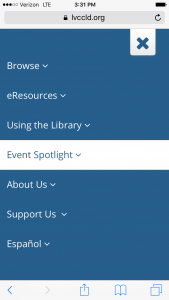
...is condensed to the three bars menu icon. Once you've pressed the three bars, you'll see a blue screen like the one shown below. This menu features drop-down menus, just as you would see at the top of the screen on desktop. (Note: Events is the same as Event Spotlight!)
One other difference we would like to highlight is the search bar, and how your search results are displayed. On the desktop, you'll see Search the _______ by ________, and select your choices from the drop-down menu.

On mobile, you'll want to press the magnifying glass icon to reveal the drop-down menus:

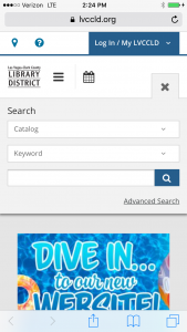
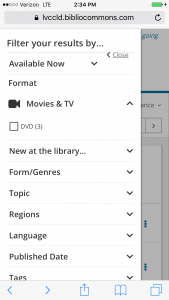
Press the blue magnifying glass icon to conduct your search. On your mobile search results page, you can filter your results be selecting the blue Filter Results button, to see the same options you would on desktop.
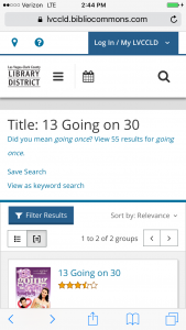
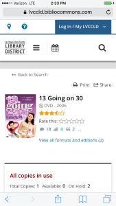
Once you select an item, the first thing you will see on its catalog record is item’s cover, title, author, release date, etc. (shown on the left on desktop.) To see everything else, keep scrolling up.
What would you like to see for our next Tip of the Week? Tell us in the comments!


Add a comment to: Tip of the Week: Navigating the Website on Your Mobile Device